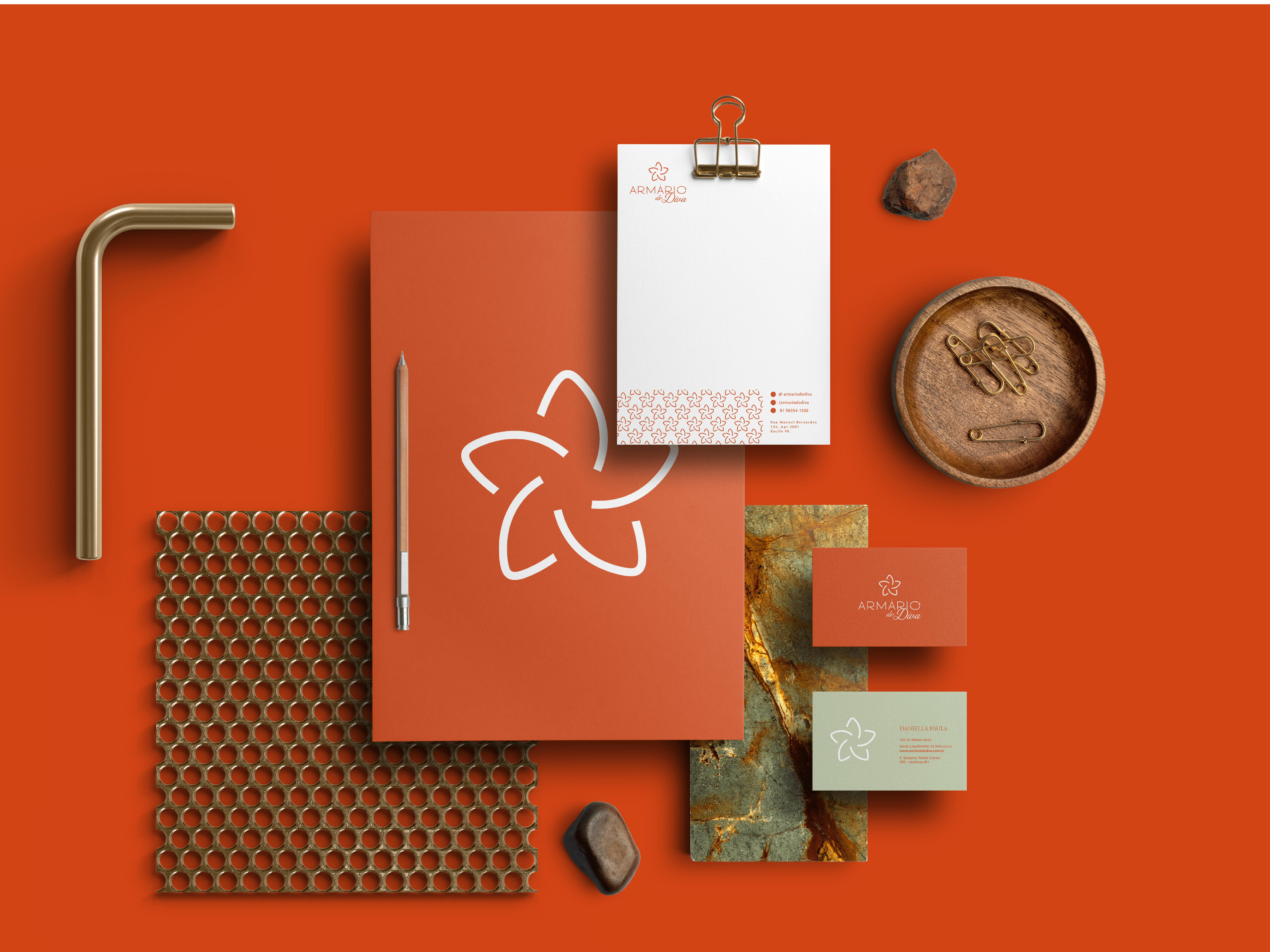
SALVATERRA // 2024 — RECIFE / PERNAMBUCO - BRASIL
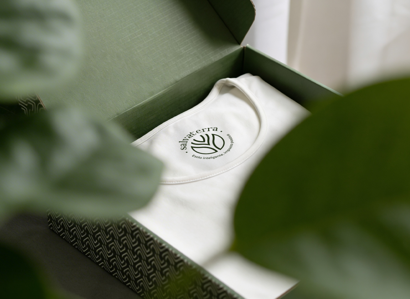
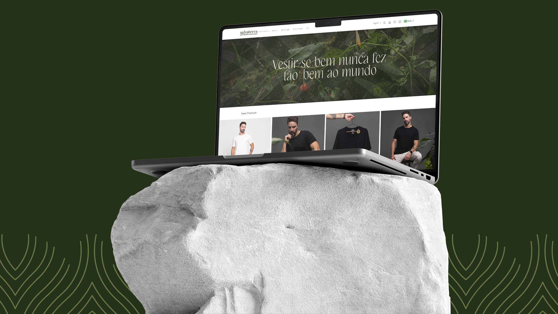
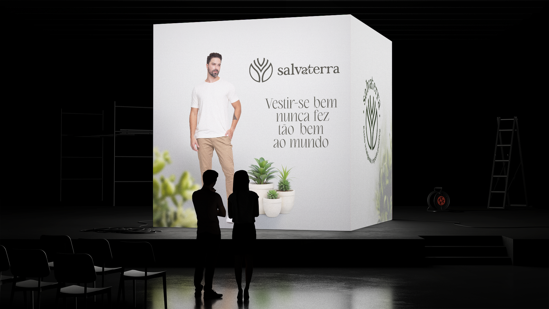
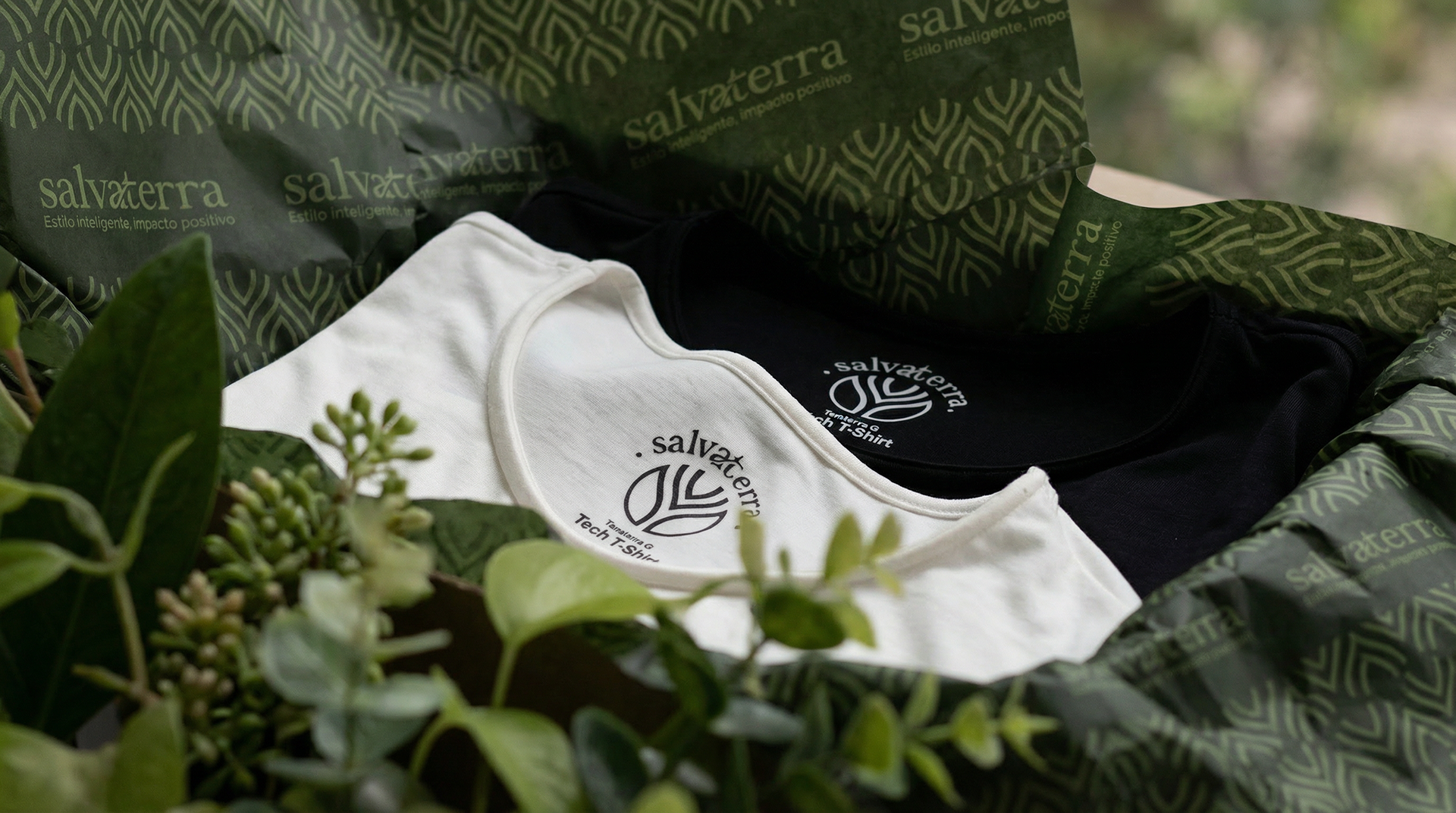
Salvaterra é uma marca de moda tecnológica e sustentável que une inovação, funcionalidade e consciência ambiental. A empresa nasce com o propósito de oferecer roupas que proporcionam qualidade de vida para as pessoas e impacto positivo para o planeta, utilizando tecidos de alto desempenho como o modal.
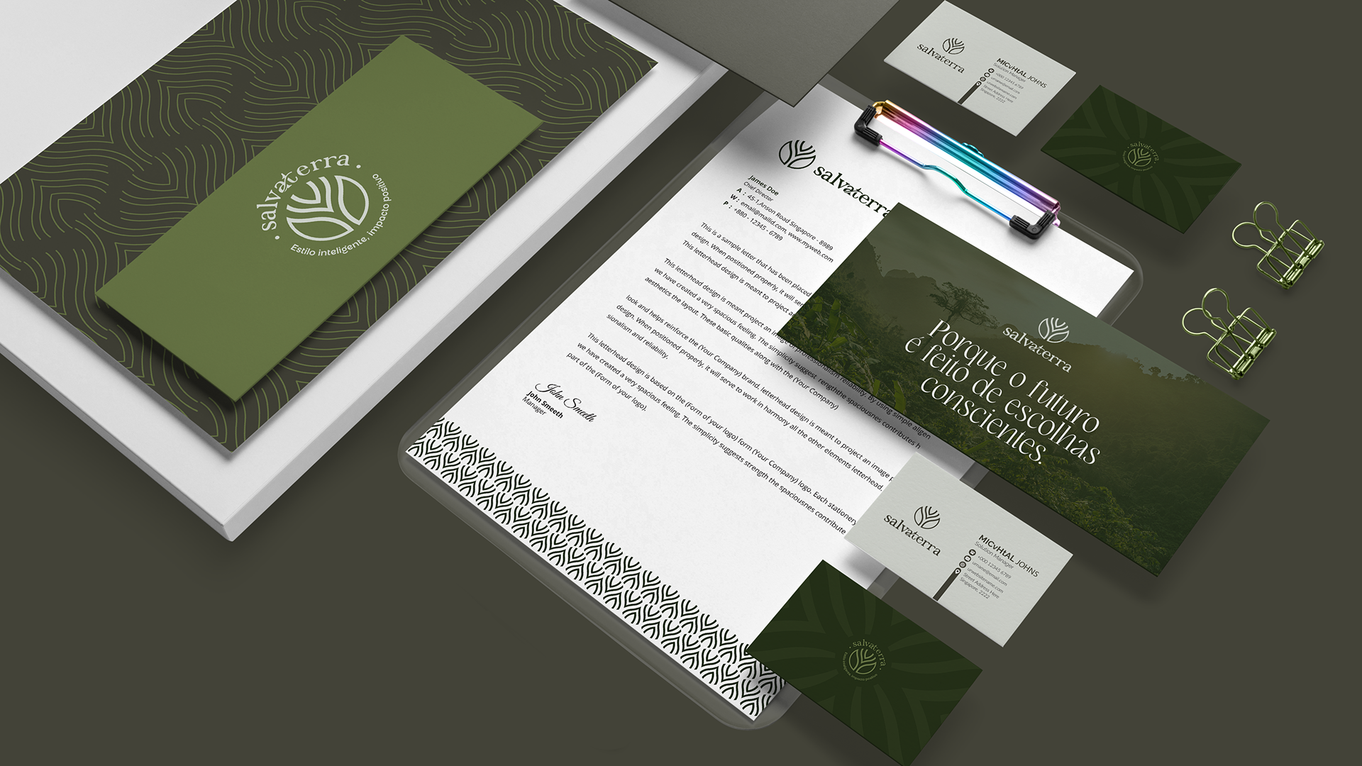
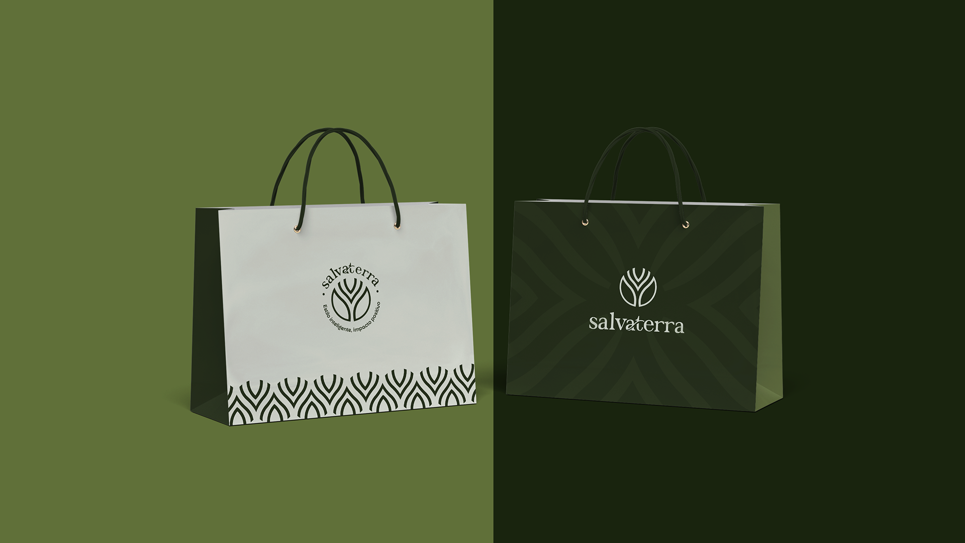
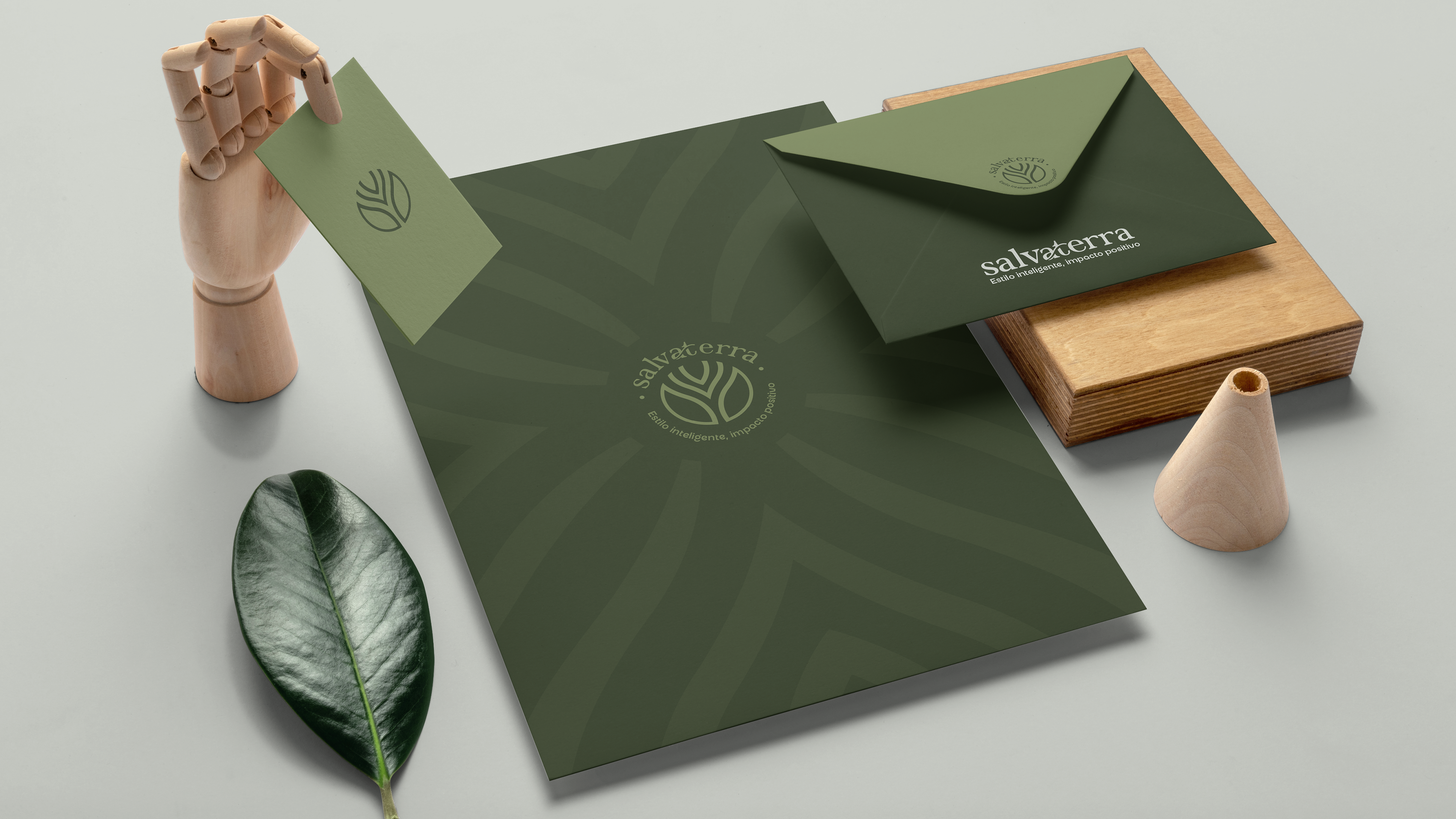
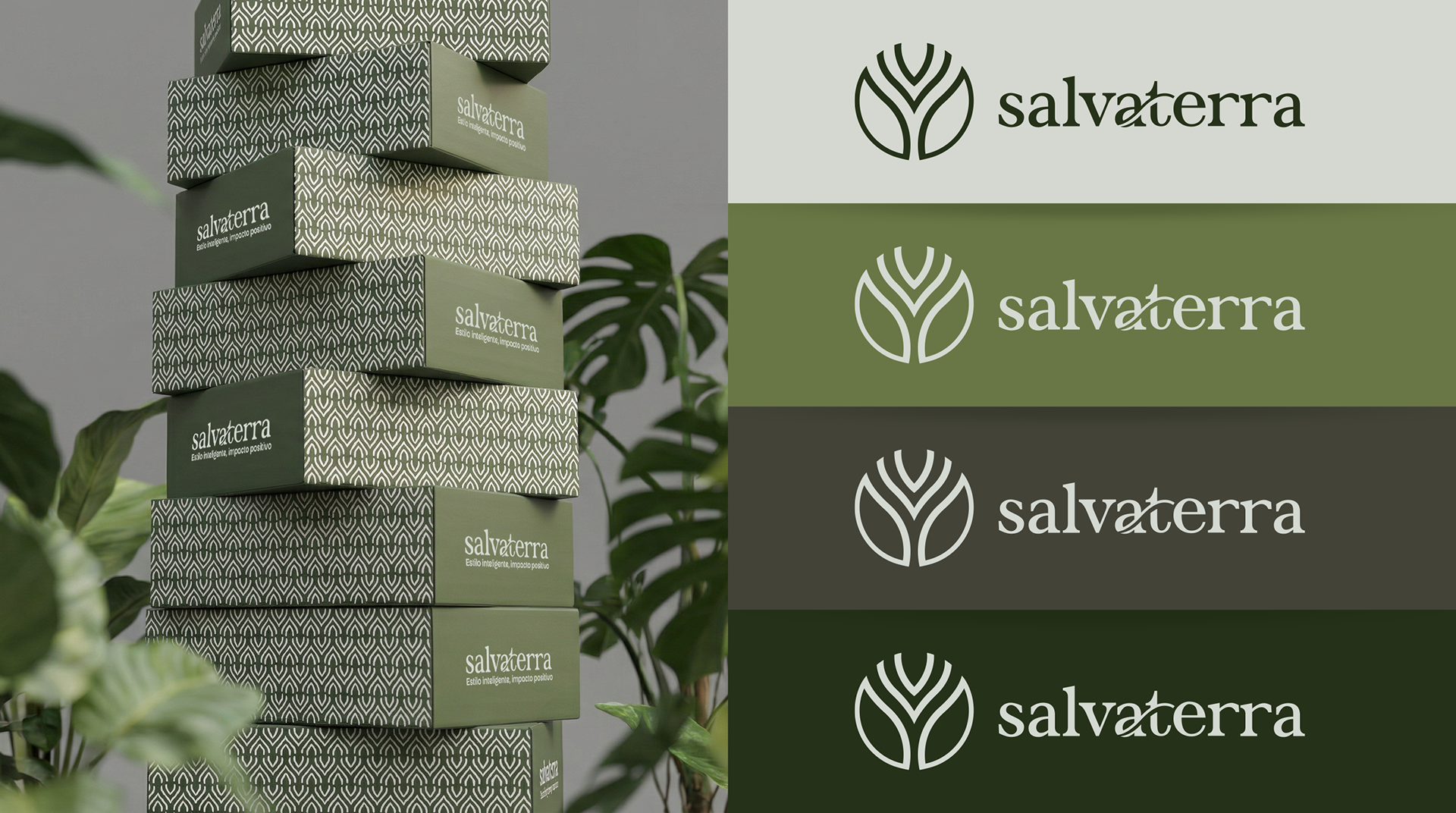
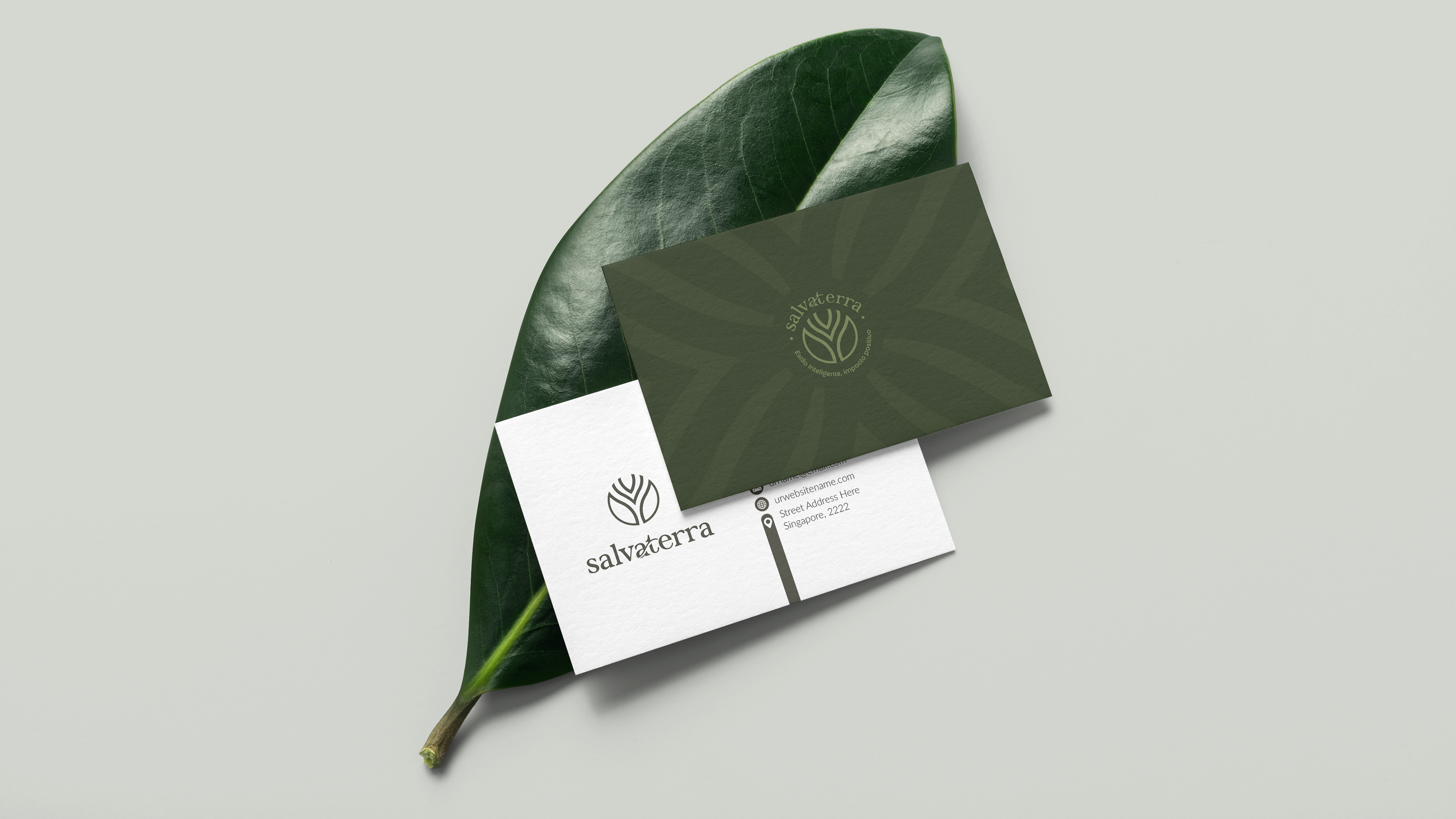
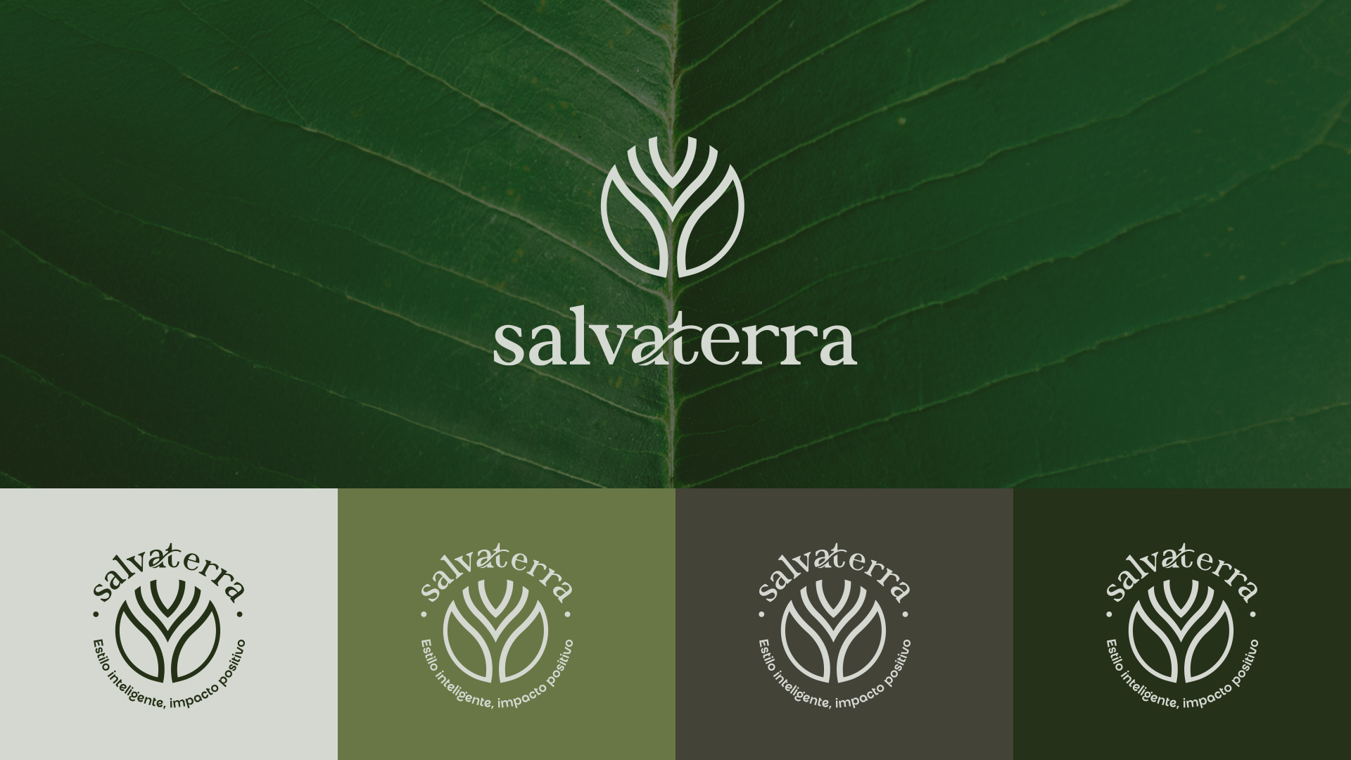
A identidade visual da Salvaterra foi pensada para transmitir conexão com a natureza, equilíbrio, modernidade e responsabilidade. A marca representa a união entre tecnologia e sustentabilidade, refletindo um estilo de vida prático, consciente e urbano.
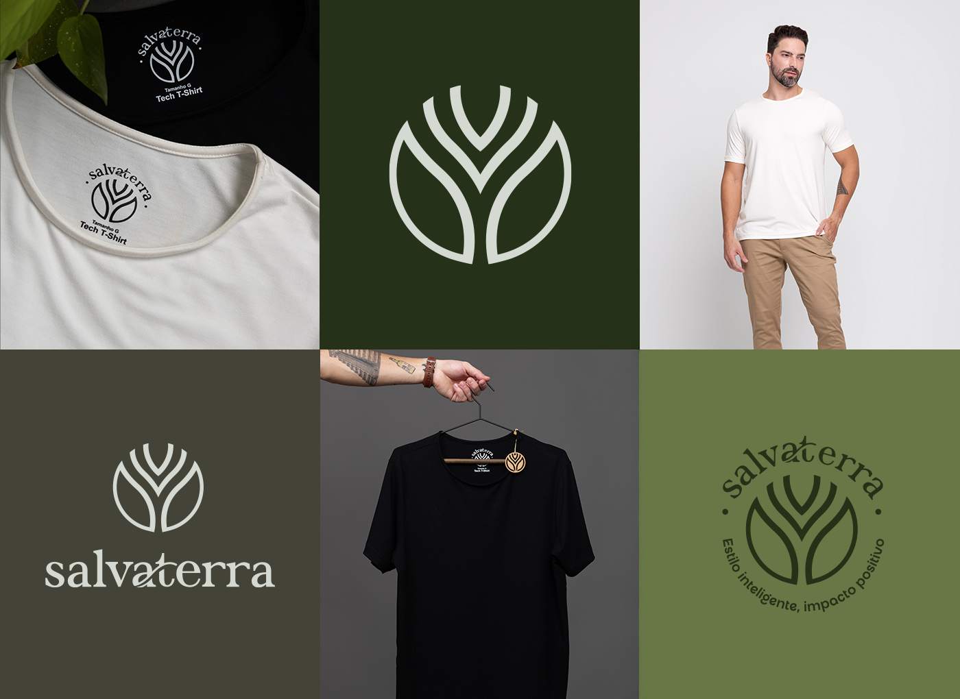
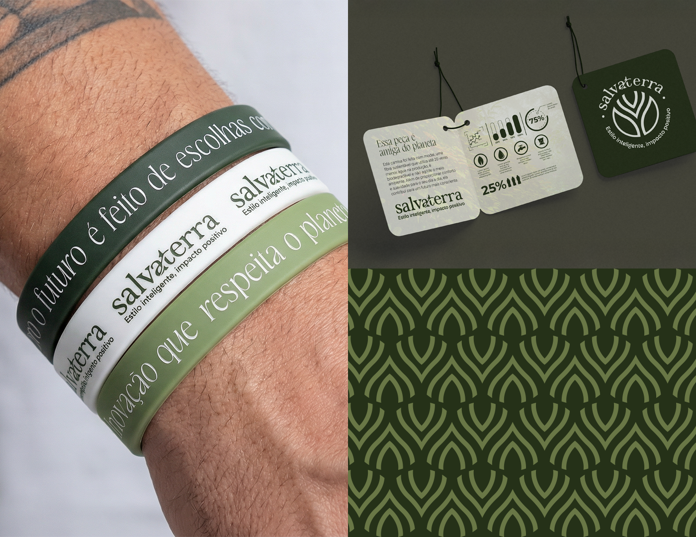
A paleta em tons de verde traduz estabilidade, regeneração e confiança. O verde escuro representa a força das raízes e a profundidade do compromisso ambiental. O verde oliva simboliza frescor, acolhimento e simplicidade. O verde acinzentado conecta natureza e modernidade. O cinza claro equilibra a composição visual trazendo leveza e sofisticação.
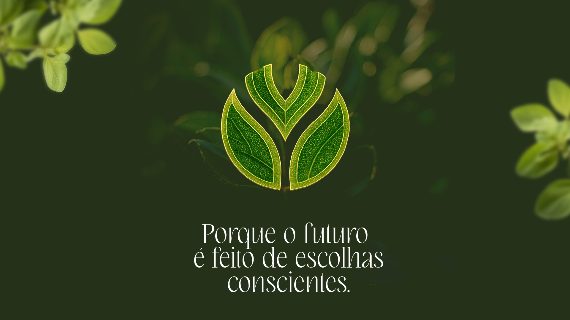
O logotipo foi desenvolvido com tipografia elegante e orgânica, com traços que remetem a folhas e crescimento natural. A construção visual reforça a ideia de expansão, raízes e evolução constante. O desenho possui leveza, boa legibilidade e transmite sofisticação com simplicidade.
O símbolo é composto pela fusão de três conceitos principais:
Elemento orgânico (folha) + Estrutura de crescimento (raízes / expansão) + União entre Sol e Terra (energia e estabilidade).
Elemento orgânico (folha) + Estrutura de crescimento (raízes / expansão) + União entre Sol e Terra (energia e estabilidade).
—
[EN]
Salvaterra is a technological and sustainable fashion brand that combines innovation, functionality and environmental awareness. The company was created with the purpose of offering clothing that provides quality of life for people and a positive impact on the planet, using high-performance fabrics such as modal.
Salvaterra's visual identity was designed to convey connection with nature, balance, modernity and responsibility. The brand represents the union between technology and sustainability, reflecting a practical, conscious and urban lifestyle.
The color palette in shades of green expresses stability, regeneration and trust. Dark green represents the strength of roots and environmental commitment. Olive green symbolizes freshness, warmth and simplicity. Grayish green connects nature and modernity. Light gray balances the composition, bringing visual lightness and sophistication.
The logo was developed with an elegant and organic typography, with shapes that resemble leaves and natural growth. Its construction reinforces expansion, roots and constant evolution. The design is clean, legible and communicates refined simplicity.
The symbol consists of three main concepts:
Organic element (leaf) + Growth structure (roots / expansion) + Union between Sun and Earth (energy and stability).
Organic element (leaf) + Growth structure (roots / expansion) + Union between Sun and Earth (energy and stability).
—
Service: Brand Strategy & Visual Identity
Year: 2024
Brand Strategy & Design: Wallace Macedo
Location: Recife — Brazil
Year: 2024
Brand Strategy & Design: Wallace Macedo
Location: Recife — Brazil
Share your feedback about this project.
All comments are welcome!
Credits:
Follow me:
Instagram - @wallacemacedo.br
© All rights reserved - Thanks for whatching.
WALLBRAND STUDIO